Color of the Year: What’s Trending in 2025?
- Marah

- Dec 2, 2024
- 2 min read
Updated: Dec 17, 2024
Every year, top brands announce their "Color of the Year," setting the tone for design trends across the home & fashion industry. For 2024, the spotlight shines on rich browns and luxurious purples, with 7 out of 13 brands selecting a hue from these families. This year’s palette embraces deeper, more saturated tones, with only a handful of softer shades making the cut.

Warm, Dark Hues Take Center Stage
Darker, moodier hues dominated the selections, with 7 of 13 brands opting for dark saturated tones over muted or pastel shades.

The Emergence of Color Collections

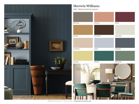
Breaking from tradition, Sherwin-Williams moved away from a singular “Color of the Year” and instead introduced four capsule collections. This approach offers a broader view of trending hues and how they interact in curated palettes, reflecting a shift toward a more holistic view of color trends. It’s an interesting departure that showcases the dynamic versatility of paint color combinations.

Benjamin Moore took a similar approach, releasing not just a single Color of the Year (Cinnamon Slate) but an entire coordinating collection to complement it.
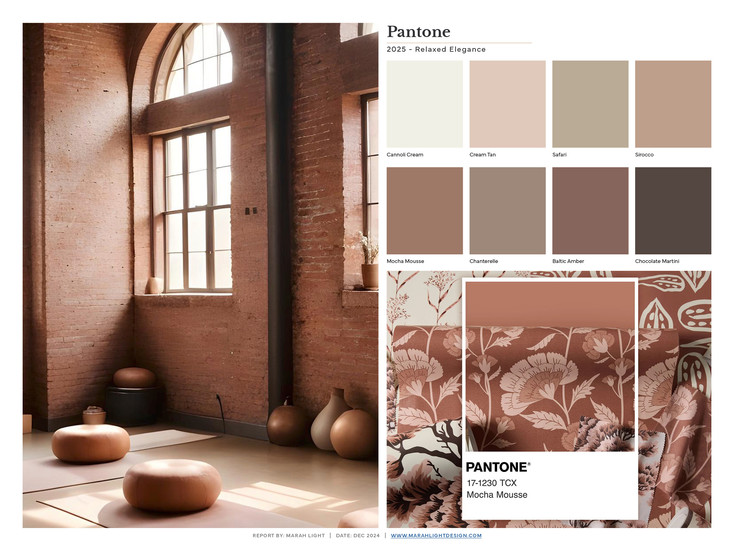
Pantone also announced 5 color palettes that work with their color of the year, Mocha Mousse.
Recap: The Full Palette Breakdown
Warm vs. Cools – Which Came Out Ahead?
Out of 109 total colors announced by 13 brands:
41% were whites or neutrals, showcasing their enduring appeal. Notably, almost all of these neutrals leaned toward warm undertones, signaling a departure from the minimalist gray tones that dominated recent decades.
31% fell into the cool tones, offering a refreshing and adaptable palette for modern spaces.
28% were warm tones, delivering a sense of richness and energy that complements the cooler and neutral hues.
When it comes to Color of the Year selections, neutrals dominated the field:
54% of the Colors of the Year were deep neutrals, but instead of soft, muted tones, brands leaned into saturated and rich hues that feel bold yet timeless.
38% were cool tones, maintaining their reputation for versatility and broad appeal.
Only 8% were warm tones, making them the most limited category this year but still offering impactful options for adding drama and warmth to a space.
This breakdown highlights how brands are moving away from safe, subdued tones of the past and instead embracing warmth, depth, and long-lasting versatility. The palettes feel grounded yet inviting, balancing trendy innovation with timeless design.
A Nod to Longevity
The 2025 palette feels like a deliberate move toward timelessness. The colors embrace rich saturation without being so vibrant as to feel fleeting. Unlike the overly bright tones of past decades (think the punchy hues of the 1970s), this year’s selections strike a perfect balance—bold but not brash, comforting yet innovative. They feel relevant now and will continue to resonate for years to come, bridging the gap between modern trends and lasting appeal.
Download the Guide
If you found this report helpful, head to my free resources page to download a copy.


Commentaires